Warning: not practical blog post, don't read, move on.
So this is a post about a thought I had - creating rounded corners in IE678 by using roundness that they already have built-in, meaning the character O.
But first:
- My opinion is that browsers that don't support border-radius should never ever get rounded corners. Let them rest in peace.
- Don't use the technique below, it's just a thought. Plus it only has one corner
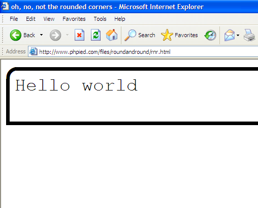
Demo
Live page demo and a screenshot in IE6:
Sales pitch
- Rounded corners in IE 6, 7, 8
- No images
- No JavaScript (a tiny self-rewriting CSS expression doesn't count)
- No extra markup
The drawbacks later.
The big idea
Use the letter O in monospace and position it in the corner.
Implementation
Markup
As promised, nothing to see here:
<p>Hello world</p>
JavaScript
None. *
* The catch here is that a tiny piece of JavaScript exists as a CSS expression. It's there to trade for clean markup. You can remove it, but then you need a bit of extra markup.
CSS
p {
  /* blah-blah, border, padding... */
  border-radius: 16px; /* for good browsers */
  background-image: expression(...); /* IE[678] */
}
The expression goes like:
this.runtimeStyle.backgroundImage="none",this.innerHTML += "<b>O</b>"
(Expression stolen from Thierry, btw)
The first part of the expression overwrites itself for performance reasons. You know that expressions are bad, cause they execute too often. Well, this.runtimeStyle shuts down the expression. If you wonder, runtimeStyle is IE thing which makes styles even more specific than inline style attributes. And this refers to the HTML element, in our case the P.
The second part of the expression (note the , separator, that's kinda funny) updates the innerHTML of the P adding a B element. So the end result of running the expression at initial page load is DOM like:
<p>Hello world<b>O</b></p>
And if you prefer, you can put that markup and get rid of the CSS expression.
The rest of the CSS is just wrestling to position the O in the corner:
b {
  background: white;
  display: block;
  font-family: monospace;
  font-size: 72px;
  font-weight: bold;
  height: 41px;
  left: -18px;
  overflow: hidden;
  position: relative;
  top: -74px;
  width: 25px;
}
And this is it.
Drawbacks
I'm sure my critical readers can think of drawbacks but let me start:
- In general principle, why would you care about rounded corners in browsers that don't know about border-radius?
- You can't have different background inside and outside the box, because you can't style the inside of the O with a color different than the outside. However you might be able to find a character that can.
- Playing with font sizes and positions is tricky. However there's probably a better way to position the O
- If you managed to select text outside the "hello world" (if you do Select-All for example) to copy, you'll paste "hello worldO" 🙂 Which is exactly what screen readers will read and your page might sound like a weirdO
So there
Maybe someone else have already thought of the idea of using a character as a corner (and has a better implementation), but that's all from me. I'm not recommending this approach, just an itch I needed to put out there. Thanks for reading!


